I’d like to cover a very repetitive situation that comes up often in the design world, hopefully other designers and clients will find this information useful for reference. This article is all about enlarging common bitmap graphics and digital photos, specifically focusing on the image quality problems that arise in the process and a very basic workflow or rule of thumb to avoid the issue from causing problems. I know this subject has been covered many times by others and it is typically covered in most digital design schools in basic classes, but I figure I might as well go ahead and try explaining what’s up in my own words.
If you are a designer yourself or working with a designer, after reading this you will definitely be able to avoid some major headaches and have a better grip on achieving high quality, high resolution graphics or images. It is actually such a surprisingly complex issue to cover though, most people such as myself find it is quite difficult to explain in person cohesively. Often times designers cannot quickly or easily cover all the details involved with the obstacles of what seems to be a task most people take for granted as being easy or simple. Like many things with computers, in theory it should be a piece of cake, but soon enough you will find that tasty delicious cake is a complete lie!
So… A client asked the other day if I could make a particular bitmap logo bigger for a print project and I was reminded yet again of all the issues that come up with that kind of request. The answer is, “Yes I can easily make it larger, but there is a catch..”.
You see, it is a very common misconception that it is easy to enlarge any graphic without consequence. Almost every time you are enlarging or up-scaling a bitmap graphic in particular, you will run into some unsavory quality issues that I’m about to explain. A really good designer with experience can of course use a number of techniques to fix issues that are related to up-scaling, but depending on the complexity of the image, it can take a tremendous amount of time and effort adding a huge cost to the project. Often it isn’t worth the time or money, so the client gets stuck with a piece of crap image and might be confused how they ended up with that.
So why can’t we scale things larger easily and maintain image quality?
That should be a piece of cake for any designer, right?
I agree that it should be simple, but the reason for why it is not simple has less to do with a graphic designers skills as much as it is simply a limitation with the technology we have currently available. The real problem is that in a small image, there is a lot of missing detail. To enlarge that image, all that detail which should exist needs to be re-created somehow and this can obviously take a lot of time for a designer or artist to do manually depending on the nature of the detail and how complex it is. It can very quickly turn into a huge time consuming task for even the most talented designers or artists if the design is somewhat complex or detailed.
This isn’t the case if you are doing the reverse, down-scaling a large image. This is because all the detail already exists to begin with, so you aren’t adding or recreating anything in that case. You are instead basically throwing detail away, which is a lot easier for the computer to achieve since it doesn’t require very much guess work or intelligence. So.. Creating something specific from nothing actually requires quite a bit of intelligence typically but throwing things away is rather mindless.
Even with analogue film photography, there is a limit to how much a negative can be enlarged before the image starts to just look like a blur, beyond that point in the old days before photoshop and image editing software, a talented photographer would pull out a brush and some paint to recreate the lost details through a painstaking manual approach. We might comprehend in our mind that in real life the detail is there even when we cannot see it, and we might even be able to visualize the missing details with our imagination, but the photograph can only contain a finite resolution and cannot capture or display anything beyond its limits. So although at first it might seem that the task of up-scaling should be simple, there are a number of limits with how the technology works that are at play.
First of all, there are two primary types of image technology most designers work with commonly. To understand the best to approach this kind of issue and what sort of options are available to designers, you need to have a basic understanding of these two image types first. So let me explain roughly some details about these two primary image technologies known as bitmap and vector images before I cover the issues with up-scaling a bitmap image.
A bitmap image is probably the most common sort of digital image/graphic around today. All digital photography for example is being saved as a type of bitmap image. Many people might call them a jpeg, but jpeg is only one of many format flavors that a bitmap image can be stored as. Different formats have different benefits and detriments because they are each best suited for certain purposes, but that is a whole different subject. Jpeg format is very common for bitmaps because it compresses an image very well but maintains fairly good quality. Compression basically means the format is making the file a bit smaller, but to do so, the software ‘intelligently’ sacrifices some of the image quality to make the image smaller in storage space. This is good for websites where you want small files, but bad for printing because you don’t have the absolute maximum quality as in other bitmap formats.
So what is a bitmap image though?!?!
This right here is a bitmap!!!
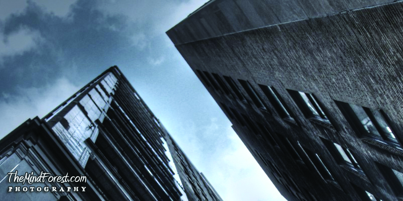
Typical bitmap photograph..
Boom.. That is beautiful.. Yet the beauty is all just an illusion which is spoiled when you look too closely. Just like a magic trick! Lets take a peek behind the magicians curtains.. A bitmap image can basically be thought of as a grid of tiny different color squares, and if you zoom in very close on a bitmap image that is exactly what you will see.
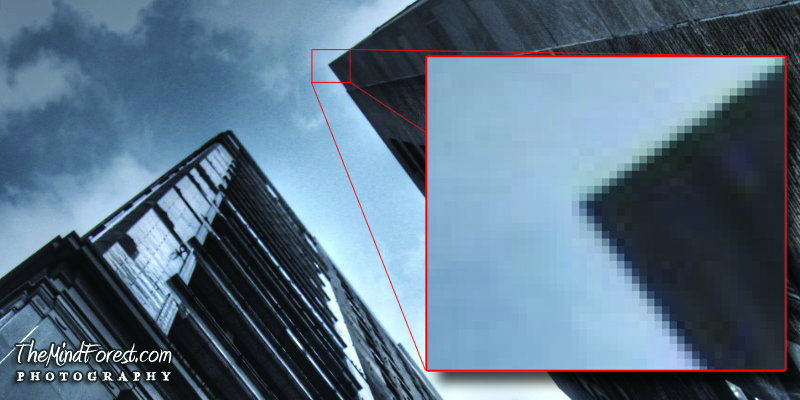
Bitmap photograph with a small portion zoomed in very close..
In this example, you can clearly see the grid of pixels. Each square is a different color, although in this example some of the squares actually have the exact same color and are indistinguishable, such as the blue pixels that make up the sky portion. Even though two pixels right next to each other might have the same color, the computer knows they are two separate pixels and keeps a unique value for both pixels in case one needs to change color for any reason. Even an image of all white pixels or all black pixels, the computer is still storing a value for each pixel in the image. When you view the image from a certain distance or size, the grid of separate squares blend together into an single cohesive image.
When you looked at the first bitmap photograph above, without prior knowledge of bitmaps and pixels, you can not easily tell it is made up of a ton of little squares until you see the closeup view. Most people have no idea this is what they are looking at, and don’t really think much about it other than the fact that it is a picture of something. Computer monitors are designed to be seen from a few feet away which maximizes the illusion of this effect of the grid of pixels melding into a single image, but if you use a small magnifying glass and look very close you can see the different squares on your monitor or TV. These squares on the monitor or TV can be thought of as physical pixels actually if you like.
With a pixel based bitmap image, there are a lot of interesting kinds of manipulations that are possible these days with a variety of software. A number of folks have made successful careers out of pushing these little pixels around with code. Many people are familiar with bitmap manipulating phone apps such as instagram, which add filters to bitmap photos captured with a phone camera, generating stylized looks for photos instantly after the photo was captured. Bitmaps are a favorite image type for many designers and digital photo editors because of the variety of tools and manipulations available for editing bitmaps.
A pixel based image can also contain millions of colors in a single image because each pixel can be a variation of any color, referred to as a shade. This ability to represent any color in the visual spectrum on a pixel by pixel basis allows for a bitmap to achieve total photo realism, because in the real world objects and scenes are usually composed of millions of shades of colors as well ( even though we might groups similar shades of colors into a single color ). Another interesting thing to note is that the same pixel based bitmap technology is also behind the majority of moving pictures in digital video and film.
Having the right size is very important depending on the use for the image to get the best results. For example when designing or creating any bitmaps for a website, it is important that the number of ‘digital’ pixels per inch in a bitmap image match the ‘physical’ number of pixels per inch of computer monitors, which is universally 72 dpi. DPI stands for dots per inch, but also can be thought of as pixels per inch.
When designing images for print, sometimes an even finer resolution of dots per inch is used to get a better quality image than what is acceptable for a computer monitor. Ranges of 150 for medium quality prints and 300 for higher quality prints are common. This allows a print to look even more like a photograph, because it can have finer dots making up the image which results in better quality of the details in an image.
There are some drawbacks though to being stuck with a pixel based image, and one of the biggest ones of them all is the issue of up-scaling bitmaps. The reason it is such an issue, is because people generally assume the software of today can handle any issues that can come up and overlook this issue. Therefore it is common for people to assume there is nothing to be concerned about and as a result, they are unknowingly sometimes putting a lot of stress on a designer when putting them in this situation.
When up-scaling and image you are essentially just making that grid of color squares larger, yet if you make that grid larger, the squares it is comprised of become more visible ultimately ruining the illusion or producing a very undesirable result. I’ll go into even more detail about bitmap resolution problems in a moment with some examples, but let me explain a bit about the second common image type beforehand.
The second sort of image type is called a vector image and these are not commonly used or understood by the general public. This kind of image is based on an entirely different system and set of rules than bitmap images and the two do not function at all in the same way. Although they can be combined in various ways to some degree, they have some really major differences.
Rather than forming an image out of a bunch of small color squares or pixels in a grid, you can think of working with vectors as instead using 2D polygons that have any arbitrary number of sides to create a variety of colored shapes which produce your image. The shapes and curves created are defined with mathematical algorithms, and so they are limited somewhat in how they handle colors and shading.
A vector shape can be made of a single solid color or it can be made of a gradient of colors, but you cannot easily achieve the same control over colors on a pixel by pixel basis as you can with a bitmap image. For this reason, Vector graphics often have a very cartoon like style when compared to bitmaps, achieving the look of a photograph that has millions of colors with vectors is possible but not practical at all.
That is because the computer would be doing tremendous calculations to create millions of mathematical polygon shapes and recreate them each time you make a change. The more shapes you create, the more calculations the computer has to chug through to generate the image. The main benefit to using a vector image is that because the shape is defined by an algorithm, it can be scaled larger or smaller without effecting the quality of the image. So very fine details in a vector object will remain sharp and clear, even if the image is re-sized small or huge.
OK.. So now you know the absolute basics about Bitmap and Vector images.. I can show some practical examples of the drawbacks of scaling bitmap images larger. Like I said, a bitmap image is made of a grid of color squares, so when you scale a bitmap larger you are technically just making the whole grid of color squares larger.
Lets say a client asks me to create some images for a poster they want to print. They give me an small image ( this could be a logo, graphic, or photo ) and want to know if I can make the image larger.. Lets say this is the image they give me..

A tiny bitmap image..
This image is only 82 pixels wide, which makes it a little larger than an inch when viewed on a monitor (since computer monitors have 72 dots or pixels per inch). They want the image scaled to somewhere around 500 pixels wide by 500 pixels tall, scaling up from the original 82×82 dimensions. So lets look at the kinds of results we would get with such a scenario.
Programs such as photoshop have greatly improved the results when scaling bitmap images larger. In more recent versions of the program, a smoothing filter is applied to hide some of the most obvious issues that used to be an even bigger contribution to the scaling problem before, so the resulting image is very smooth now but very blurry. Here is a visual example of what happens when the images is enlarged with photoshops new filtering methods from 82×82 to 500×500.
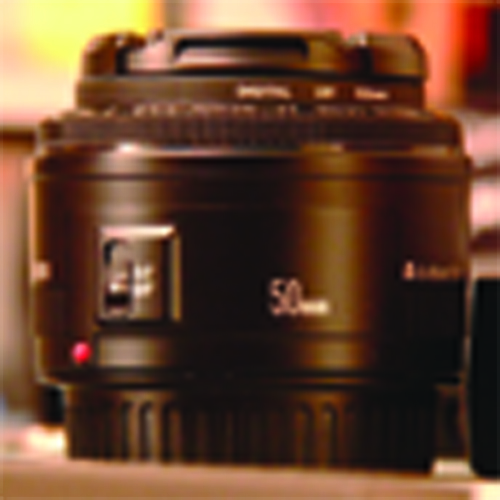
A small bitmap scaled larger..
The image becomes very blurry as you can see, and all the detail that exists on the actual object in the real world is lost in this blur. The smaller image looks sharp in comparison, because it is the right resolution for its size. There is no way for the computer to know from the tiny image it is given initially, exactly what details should be emphasized in the image when scaled larger.
Now I’ll show what this image looks like without the automatic filtering that is applied in recent versions of photoshop. In older versions of photoshop, this is the kind of result you would get. If photoshop wasn’t applying a filter blurring the image, the pixels which have been enlarged now would be extremely noticeable. This kind of image is often referred to as an aliased image, a blocky or chunky image. This result would be very difficult to fix and it is pretty much unusable.
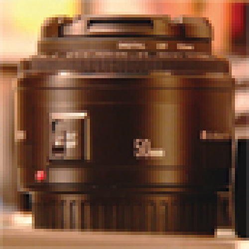
A small bitmap scaled larger without any filtering..
Photoshop has introduced a new ‘smart’ scaling option called content aware scaling. The theory is that the computer does even more calculations than usual to determine what the missing details in the image are in an attempt to maintain a sharper and more accurate scale from a guesswork analysis of the image. Sounds good in theory and on paper, but in practical application it doesn’t always achieve usable results. The computer still really has no idea what is happening in the real world in regards to recreating lost details, so it is using all these fancy calculations try to recreate or maintain details but getting a really ridiculous result because ultimately it is just making guesses.
Content aware bitmap scaling..
You can all of these results are not ideal and a LOT of work would be needed to clean up or recreate the details that are lost with an up-scaled image. Sure, an artist or designer can paint in these details manually if they know what they are doing, but it would take a lot of time and often the effort is simply not worth it in most cases. They might as well create a digital painting of the image from the get go if faced with this problem, which you can imagine is not a speedy process.
So the program is failing pretty badly in this kind of situation using content aware scaling, the result is actually pretty sad. It is even worse and less accurate than the regular scale method with filtering because it is distorting certain parts of the image greatly trying to figure out relations between pixels and parts of the object where it assumes what you think might be important. Without any post filtering there is also very blocky look to the image which resembles the older method of scaling images before photoshop had this automatic scale filtering business integrated..
All of these up-scaled images so far pretty much completely suck when you compare to an image that has the correct size ( or larger) and resolution in mind to begin with. Observe…
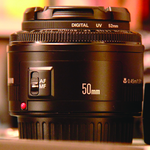
An image that is the correct resolution.
The original photo I am using for this example was very large to begin with, which is an ideal situation to avoid up-scaling problems.. This original image is so large, it doesn’t all fit in the 500×500 image the client needs, but that is OK. I’ve actually drastically down-scaled from the original photo, but typically no serious quality issues are introduced when down scaling a large image. So with bitmaps it is pretty much always OK to make them smaller, because the grid of pixels just gets finer in detail as you scale it down, so it is ideal to start with a larger image and scale it downwards. The rule of thumb is to get the largest source image you think you might ever need from the start and scale it down if needed.
Here is a more practical scenario to help you understand better how it works in a real world kind of situation…
Lets say for example that you are designing a logo yourself or having a designer create a logo for you using bitmap image technology. You consider one day it might need to be on a billboard when your company grows, but for now you only need it for a business card. Most people would design it for the card first, they might think it is easier to just deal with this smaller version of the graphic initially. With up-scaling image problems in mind however, a forward thinking person would create the design from the beginning to be large enough for the billboard, then scale the large image down for a business card after creating the highest resolution image they think they will need. Sure, it takes longer to create a higher resolution version of your logo to start with, many computers will have to work hard to manipulate a larger image so making adjustments and changes will take longer, but it takes less time than having to create the same logo twice.
The logic behind this is that it will save you time and work in the long run, because if you design the logo small for your business card initially and then enlarge the image for a billboard later, there won’t be enough detail so the image will have quality problems demonstrated in the examples above, and your logo will have to be remade again larger with the proper detail. You will get a blurry, terrible looking logo on your expensive billboard otherwise. When you scale upwards with a bitmap, you are almost always guaranteed to run into some issues as I’ve shown in these examples. However if you can always start with an image larger than what you need, you won’t have a reason to scale it upwards and you will avoid these issues ever becoming a major problem for you.
Now is a good time to discuss a bit more detail regarding the approach of using vector objects and what kinds of benefits and drawbacks they introduce to this kind of scenario. In contrast to a bitmap, if you design a logo with vector technology the image can scale very well without any quality issues. This is again because it is not dealing with a grid of color pixels but rather it is dealing with a shape defined using mathematics under the hood. Like I said before, with vector images you can think of graphics as being created with polygon shapes. They can have any number of sides per shape, they can also use curves instead of straight lines to define complex organic shapes.
The main drawback to vectors is that they cannot easily work with millions of colors in a single scene to produce a photographic look like a bitmap image can. You cannot simply get anything near what looks like a photograph or realistic result without a fairly tremendous effort. A talented vector artist can get very close to the look of a photograph using vector art, and a great deal of beautiful imagery can be created with vectors. To create beautiful vector artwork takes a considerable amount of time to do, and often is not practical if someone is expecting a quick and painless scaling operation for a bitmap image initially. Here is an example of a vector graphic I’ve quickly created to give you an idea of the more common cartoon look that vectors are more widely associated with.

A vector image.
Now although vector images cannot easily have the color capabilities of a bitmap image, they make up for it with having infinite resolution when scaled. So here is an example of the same vector when being up-scaled..

A vector image that has been up-scaled.
You can clearly see, none of the detail is lost or blurred out when being scaled drastically larger.. In fact some finer detail that wasn’t as clear before is made even clearer. This amazing scale capability of vector images is why they are so popular for people who design logos and print media, despite the limitations with color. They can be scaled without any consequence to the image quality. For reference, I’ve created an image to show what basic shading looks like on vectors below.

A vector with basic shading.
You can achieve better shading and more complex gradients than this if you have time to spend tweaking and improving it, but using simple gradients to add some shading like this is the fastest approach.
So lets say that we go back to the business card and billboard example. If you design a logo using vector image technology, it might not look quite as fancy with the shading and color options as a design using bitmap technology, but you won’t run into a problem scaling the image to fit on a business card or a billboard. The image will look sharp and crisp at any size, even if you made a huge billboard that is the size of an entire building.
One more thing that makes all of this that much more confusing for young designers with limited experience is that the two technologies ( vector and bitmap ) are now integrated in many applications to some degree or another. For example, you can do some bitmap manipulations within illustrator which is primarily used to create vectors, and you can also create vectors within photoshop which is primarily used for bitmaps. This is really in place for some quick usages and convenience in some situations, but the limited tools currently are not a replacement for the real deal.
The vectors within photoshop have simple editing capability and are often turned into a bitmap image at some point, and bitmap images within illustrator often have very limited control and usage because they have no true bitmap editing tools integrated. I recommend that you learn both applications in detail if you can, because they are both going to be used very differently and each one offers many unique benefits over the other. You will have maximum control over your work if you use the right tool for the job, and if you stick with only one application you will be limited very much with your understanding and capability.
Now for those of you who are quite tech savvy already, you might not be terribly surprised to learn a decent solution has already been developed many years ago to deal with bitmap up-scaling known as the Lanczos filter. However that particular filter technology is closed off and locked into proprietary video conversion utilities. If you are interested regardless, go ahead and check out this wiki article just for kicks..
http://en.wikipedia.org/wiki/Lanczos_resampling
There are other solutions though these days after doing a little searching, some are even free!
Here is a link to another website I just found with some interesting software related to this subject..
http://www.computingunleashed.com/enlarge-images-without-loosing-quality.html
Regardless of the decent results these up-scaling algorithms can produce, they are still not perfect and most likely will have some noticeable artifacts. I haven’t had time to experiment with any of these yet myself to be able to give any sort of opinion as to how effective they are in a variety of situations, but they certainly look like they might be useful in some cases relating to this issue. There are plenty of scenarios I can think of though where this kind of technology would fail to produce effective results, again it is only trying to do the best with what it has to work with and it is limited by design. It cannot produce accurate details out of nothing, if an image is too small and those details are simply not defined enough, but it will do the best it can based on the image it has to work with. I won’t be surprised if adobe eventually implements similar filters in the future directly in photoshop, and I’d say it is about time they addressed this particular issue before they go adding in any other fancy pants tools like content aware scaling. These technologies certainly won’t win over using/creating an image or photograph for the proper resolution to begin with anytime soon.
Well, there is a ton more detail and scenarios to fully explain this subject of up-scaling, there are some cases actually where it is not a problem or has very little impact on image quality. When you are already working with very high resolution images to begin with, sometimes there is so much extra detail an image can be up-scaled a great deal before any visual artifacts cause problems. However that kind of situation is very uncommon even today because many people are not working with such high resolution source images on average. So I’ve really just only scratched the surface in my explanation here, but I think this covers the basics so that people can make better decisions about how they go about dealing with their digital media.
If you have questions or additional input leave a comment or send me an email.. ![]()

Hello
I’ve read your article on the issues of up-scaling digital photographs and thank-you for the insight. I’m not a graphics designer but am inadvertently learning as my issue is of a different nature due to my own lack of due diligence. I had travelled for many years around the world but a few years ago after landing in the Congo, Africa, I had realized that my digital camera, external hard drive and laptop had been stolen with all my pictures taken up to that point. These included travelling all over Africa, Canadian Arctic and working in the Maldives….which included pics of the Tsunami destruction while I was there. The only saving grace was that I had a copy of all my pics on my ipod classic….but…..they were all stored basically Thumbnail size. Hardly worth showing anyone, because enlarged, too much detail is lost. I’ve tried trial versions and free up-scaling programs (like Perfect Re-size, PhotoZoom, SmillaEnlarger) with disappointing results. So I’ve started basically up-scaling with the best results possible just for show, and keeping the originals hoping the technology will advance someday to get close to original quality. Thanks again for your article and will be monitoring your site for updates. Regards, Randy